
Icons are not decoration. They are functional promises inside a product interface. Every icon silently tells the user what will happen next, which actions are safe, and which states can be trusted. When these promises are consistent, users move faster and stop second-guessing the interface. When they break, hesitation appears, mistakes increase, and support tickets follow.
As products scale and teams grow, icon decisions compound quickly. A few inconsistent choices can turn a clean interface into a visual collage. This is why icons must be treated as infrastructure, governed with the same discipline as typography, color, and layout. This guide explains how to select, govern, and integrate Icons8 icons with design-system rigor while still shipping at real-world speed.
Define Meaning Before You Choose Visuals
Build a Shared Vocabulary First
Before selecting a single icon, teams must agree on language. Start by listing every action and object your product supports. Navigation, create, edit, delete, upload, download, import, export, search, filter, sort, messaging, media controls, administration, alerts, and system health are common foundations.
This list becomes the backbone of icon selection. Icons8 tagging favors practical, technical terms that align with how product teams write specs, tickets, and commit messages. When vocabulary is agreed upon first, icons become visual representations of shared meaning rather than subjective art choices.
Language Prevents Metaphor Drift
When teams skip this step, different designers may choose different metaphors for the same action. Over time, users see multiple visual meanings for identical behavior, which erodes trust. Clear language locks meaning early and keeps icons interchangeable across surfaces.
Test Icons Where Users Will See Them
Real Sizes Reveal Real Problems
Icons should never be judged in isolation or at large preview sizes. Test them at sixteen, twenty, and twenty-four pixels on both light and dark backgrounds. Place them inside navigation bars, toolbars, lists, and tables where density and contrast matter.
Icons8 families are designed with shared stroke rules, corner radii, and optical centers. This consistency ensures that icons hold visual rhythm even when layouts shift between mobile, tablet, and desktop.
Reject Weak Icons Early
If an icon collapses, tilts visually, or appears lighter than its neighbors, it will fail repeatedly across the product. Early rejection saves hours of downstream fixes and avoids inconsistent exceptions later.
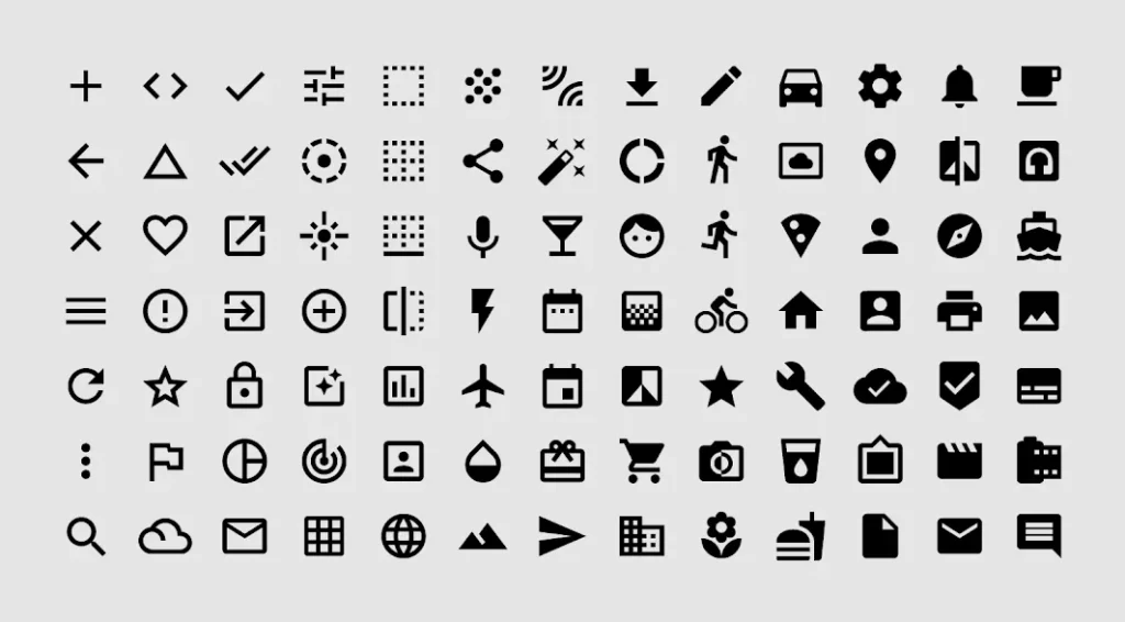
Treat SVGs Like Production Code
Inspect the Vector, Not Just the Shape
Every SVG should be reviewed as code. Clean paths, minimal grouping, and readable markup are essential for long-term maintenance. Icons should rely on currentColor so themes, hover states, and dark mode are driven by tokens rather than hardcoded fills.
Icons8 vectors are typically clean and predictable, which makes them suitable for inline SVG usage without extensive cleanup. This consistency allows teams to scale without refactoring assets repeatedly.
Automate Enforcement
SVG optimization should be part of continuous integration. Builds should fail if inline styles, unnecessary transforms, or hard fills reappear. SVG should remain the source of truth, while PNG exports are reserved only for legacy environments that cannot render vectors.
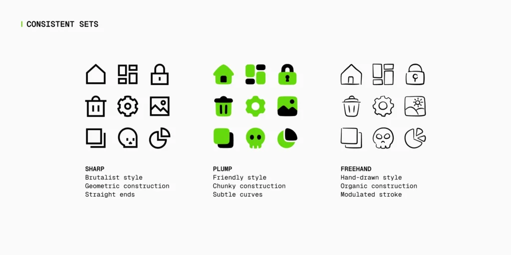
Choose a Style and Govern Its Usage
| Area | Ad-Hoc Icon Usage | Governed Icons8 System |
|---|---|---|
| Icon Selection | Random icons chosen per screen | Icons chosen from a defined product vocabulary |
| Visual Consistency | Mixed styles and weights over time | Single primary family with clear boundaries |
| Scalability | Breaks as product grows | Scales cleanly across teams and surfaces |
| Developer Workflow | Inline fixes and overrides | Central icon component with tokens |
| Theming & States | Hardcoded colors and fills | Token-driven states using currentColor |
| Accessibility | Inconsistent sizes and labels | Defined minimum sizes and accessible naming |
| Maintenance | Frequent cleanup and redesigns | Quarterly audits with minimal refactoring |
| Release Speed | Slows due to debates and fixes | Faster shipping with clear rules |
One Primary Family for Interactive UI
Icons8 provides outline, filled, two-tone, and platform-native families. Mature products choose one primary family for interactive UI and commit to it across navigation, actions, and controls.
Secondary families may exist, but only with clearly defined territories. Without written rules, style mixing becomes subjective and inconsistent.
Boundaries Reduce Design Debt
Clear boundaries remove debate during reviews. Designers and developers can focus on usability and flow rather than arguing about visual preference. Governance turns icon choice into a system decision instead of a recurring discussion.
Prepare Assets Before Downloading
Standardize Padding and Optical Weight
Before exporting icons, configure color, padding, and background consistently. Define a small size matrix with constant optical padding and commit it as a baseline inside the repository.
When all icons follow the same baseline, equal bounding boxes feel equal in visual weight. This eliminates micro-adjustments and keeps layouts balanced as the icon library grows.
Role-Based Guidance That Ships
Designers: Define and Maintain the Icon Contract
Designers should document default sizes, stroke weights, corner radii, and semantic tokens for hover, active, disabled, success, warning, and error states. Real product examples should be included to show acceptable and unacceptable usage.
Quarterly audits help identify outliers and replace weak metaphors with catalog icons that better match the contract. This keeps the system healthy over time.
Developers: Centralize Rendering and Control
Developers should use inline SVG wrapped in a shared icon component. The component resolves size and tone through tokens and references a typed manifest mapping icon names to vector paths and style families.
This approach prevents ad-hoc imports, improves performance, and ensures theming works consistently across the application.
Marketers and Content Teams: Respect Visual Hierarchy
Marketing surfaces often require heavier pictograms for hero sections and lighter glyphs for tables or inline callouts. Limiting color usage ensures icons support typography and photography instead of competing with them.
Using catalog icons rather than ad-hoc downloads keeps brand visuals consistent across campaigns and platforms.
Patterns From Everyday Product Work
Dense Tables and Toolbars
In dense layouts, outline icons at smaller sizes reduce visual noise. Destructive actions should retain labels and confirmation steps. Clear separation between row-level actions and global actions improves scanning and reduces user errors.
Settings and Onboarding
Icons help users skim and group related preferences, but they should never replace labels for risky or irreversible choices. Using catalog icons aligned with the system contract prevents metaphor drift as features evolve.
Maps, Locations, and Spatial Context
Location-based interfaces require icons that remain legible at small sizes and over photos or maps. Icons8 provides location symbols that pair well with backplates and token-based color adjustments when contrast is required.
Accessibility That Survives Deadlines
Size, Contrast, and Interaction
When an icon is the only affordance, twenty-four pixels should be considered the minimum size. Focus states must rely on more than color alone, and contrast should be verified on real backgrounds, not just design mockups.
Names and Assistive Technology
If an icon includes visible text, it should usually be hidden from assistive technology. Icon-only controls must expose a clear accessible name. Decorative icons should remain silent to avoid unnecessary noise.
Long-Term Governance and Stability
Alias Maps and Locked Metaphors
Mapping domain language to icon names ensures designers and developers reach for the same assets. Core metaphors such as search, settings, delete, upload, download, and share should be locked and only changed through review.
Treating these changes as breaking updates protects user trust and consistency.
Licensing, Audits, and Ownership
Icons8 supports free and paid usage models. Paid plans reduce attribution requirements and legal risk. Licensing rules should be documented inside the design system, with source URLs stored for easy updates.
Quarterly audits prevent duplication, drift, and outdated metaphors from accumulating unnoticed.
FAQs
Why should icons be treated as part of a design system?
Icons guide user actions and set expectations across an interface. When they are governed like typography, colors, and spacing, the product remains consistent and predictable as it scales, reducing confusion and usability issues.
Why are Icons8 icons suitable for product teams?
Icons8 provides coherent icon families, clean SVG vectors, and practical tagging. This makes it easier for design and development teams to maintain consistency and integrate icons into real production workflows.
How many icon styles should a product use?
Most products should rely on one primary icon family for interactive UI elements. Additional styles can be used only in clearly defined areas such as documentation or marketing assets to avoid visual inconsistency.
At what sizes should icons be tested before release?
Icons should be tested at 16, 20, and 24 pixels on both light and dark backgrounds. This ensures they remain legible, balanced, and visually consistent across different screen sizes and layouts.
Why is inline SVG preferred over image files for icons?
Inline SVG allows icons to inherit color from design tokens, adapt to themes, and support accessibility without creating multiple asset versions. This approach also improves performance and maintainability.
How do icons affect accessibility in UI design?
Icons must meet minimum size and contrast requirements and include proper accessible naming when used alone. Decorative icons should be hidden from assistive technologies to prevent unnecessary noise.
Can icons replace text labels in interfaces?
Icons can support text labels but should not fully replace them for critical or destructive actions. Labels provide clarity and reduce the risk of user errors, especially in complex flows.
How often should an icon system be reviewed?
A quarterly review helps identify inconsistencies, outdated metaphors, and visual drift. Regular audits keep the icon system aligned with product changes and design standards.
What is the most common mistake teams make with icons?
The most common mistake is mixing multiple icon styles without clear rules. This creates visual inconsistency and weakens user trust in the interface.
How does icon governance improve release speed?
Clear icon rules reduce design debates and rework during development. This allows teams to move faster, focus on functionality, and ship features with confidence.
Final Takeaway
Icons work best when they are treated as system infrastructure, not visual decoration. Icons8 offers a broad catalog, coherent families, and production-ready vectors that support this approach. When icons are governed by shared language, tested in real contexts, and implemented through centralized components, interfaces stay readable, accessible, and trustworthy while teams ship faster with fewer debates and fewer mistakes.
For more
For more exclusive influencer stories, visit influencergonewild