When it comes to YouTube, first impressions matter more than most creators realize. Before anyone watches your video, listens to your message, or interacts with your brand, they see your thumbnail. That single image decides whether your video gets clicked or ignored.
For businesses using YouTube as a growth channel, thumbnails are not just visuals. They are marketing assets. A well-designed thumbnail communicates value, sparks curiosity, and sets expectations. When done right, thumbnails can dramatically improve click-through rates, visibility, and long-term audience growth.
Why YouTube Thumbnails Matter More Than You Think
Thumbnails as Decision Triggers
YouTube thumbnails work like book covers. They give viewers a quick preview of what to expect and influence their decision to click. In a feed full of competing videos, your thumbnail must instantly communicate relevance and interest.
Videos with strong, intentional thumbnails consistently receive more clicks than those with generic or auto-generated images. For businesses, this means that investing time into thumbnail design directly affects reach, brand exposure, and audience growth.
Visibility and Algorithm Impact
Higher click-through rates send positive signals to YouTube’s algorithm. When users click your video more often, the platform is more likely to recommend it to others. This creates a growth loop where strong thumbnails lead to more impressions, more views, and greater authority in your niche.
Understanding Your Audience Before Designing Thumbnails
Knowing What Your Viewers Respond To
Effective thumbnail design always starts with audience understanding. Different audiences respond to different visual cues. Colors, expressions, text style, and imagery should reflect who you are trying to reach.
A business targeting younger audiences may benefit from bold colors, expressive faces, and energetic visuals. A brand focused on professionals may perform better with clean layouts, subtle colors, and confidence-driven imagery.
Learning From Your Niche
Studying successful channels in your niche can reveal important patterns. Look at the colors they use, how much text appears on thumbnails, and the emotions being expressed. This research provides direction, but copying should be avoided. The goal is to understand what works while developing a visual identity that is uniquely yours.
Designing Thumbnails That Capture Attention
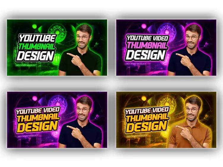
Using High-Quality Images
Image quality directly affects perceived credibility. Blurry or pixelated visuals immediately reduce trust and professionalism. High-resolution images taken directly from your videos or carefully selected stock images help establish authority and polish.
A sharp image communicates effort and reliability, which is especially important for business-focused channels trying to build trust.
Color Contrast That Stops the Scroll
Bright and contrasting colors help thumbnails stand out in crowded feeds. Contrast makes key elements more visible and improves readability on both desktop and mobile devices. While brand colors should remain consistent, experimenting with contrast can significantly improve attention.
Text That Supports the Visual Message
Text on thumbnails should be minimal and bold. A few carefully chosen words can clarify the video’s promise and spark curiosity. Fonts must remain readable at small sizes, and text color should contrast clearly with the background.
The goal is not to repeat the video title but to complement it with a visual hook.
Branding Through Thumbnails
Building Recognition Over Time
Consistent branding across thumbnails helps viewers recognize your content instantly. Subtle use of brand colors, logos, or layout patterns builds familiarity and trust. Over time, this recognition encourages repeat views and strengthens brand loyalty.
Consistency does not mean repetition. It means maintaining a visual system that evolves without losing identity.
Faces and Emotional Connection
Human faces are powerful attention magnets. Expressions of surprise, excitement, curiosity, or concern create emotional hooks that attract clicks. Close-up shots with clear expressions work especially well because they are easy to read at small sizes.
Emotion makes content feel relatable and human, which is essential for engagement.
Simplicity Is a Competitive Advantage
Avoiding Visual Clutter
Too many elements dilute impact. Clean thumbnails with a clear focal point perform better than crowded designs. Limiting each thumbnail to one core idea keeps messaging clear and avoids overwhelming viewers.
Simplicity ensures that your message is instantly understood, even during fast scrolling.
Aligning Thumbnails With Titles
Thumbnails and titles should work together to tell a cohesive story. While thumbnails capture attention visually, titles reinforce curiosity through words. Both should align without being repetitive or misleading.
Clickbait may deliver short-term clicks, but accuracy builds long-term trust and audience retention.
| Element | Effective YouTube Thumbnails | Weak YouTube Thumbnails |
|---|---|---|
| Image Quality | High-resolution, sharp, and clear visuals | Blurry, pixelated, or low-quality images |
| Color Usage | Bright, contrasting colors that stand out | Dull colors that blend into the feed |
| Text Style | Minimal, bold, and easy to read | Too much text or unreadable fonts |
| Branding | Consistent brand colors and visual identity | No branding or inconsistent style |
| Emotional Appeal | Clear facial expressions and emotions | Flat visuals with no emotional hook |
| Simplicity | One clear focal point | Overcrowded and confusing design |
| Mobile Visibility | Readable and clear on small screens | Hard to read on mobile devices |
| Click-Through Rate | Higher CTR and stronger engagement | Low CTR and poor viewer interest |
Testing, Optimization, and Performance Tracking
Learning From Analytics
YouTube Analytics provides valuable insight into how thumbnails perform. Monitoring click-through rates and audience behavior helps identify what resonates. Small changes in text placement, colors, or expressions can produce noticeable improvements.
Optimization should be ongoing rather than one-time.
Using A/B Testing for Thumbnails
A/B testing allows you to compare two thumbnail versions and identify which one performs better. Testing different styles, such as text-heavy versus image-focused designs, helps refine your strategy based on real data rather than assumptions.
Tools That Simplify Thumbnail Design
Designing Without Graphic Experience
Many online design tools offer ready-made YouTube thumbnail templates. These tools allow creators to design professional thumbnails without advanced graphic skills. Customization options make it easy to align visuals with your brand while saving time.
Efficiency is especially valuable for businesses managing content at scale.
Consistency and Mobile Optimization
Recognizable Visual Identity
Consistency across thumbnails builds recognition and reinforces brand memory. Developing a thumbnail style guide covering colors, fonts, and layouts helps maintain quality while allowing creative flexibility.
Designing for Mobile Viewers
A large portion of YouTube traffic comes from mobile devices. Thumbnails must remain readable and visually clear on small screens. Text should be large enough to read, and images should remain recognizable even at reduced sizes.

Staying Ahead by Monitoring Trends
Adapting to Changing Viewer Behavior
Thumbnail trends evolve over time. What works today may not work next year. Keeping an eye on platform trends, industry shifts, and audience preferences helps maintain relevance and competitiveness.
Adapting your approach ensures your content continues to attract attention in a fast-changing digital environment.
FAQs
Why are YouTube thumbnails important for business channels?
Thumbnails are the first thing viewers notice on YouTube. A strong thumbnail attracts attention, increases click-through rates, and helps businesses reach more potential customers without increasing ad spend.
How do thumbnails affect click-through rate (CTR)?
Thumbnails directly influence CTR by shaping the viewer’s first impression. Clear visuals, strong contrast, and a focused message make users more likely to click compared to generic or cluttered thumbnails.
Should businesses use text on YouTube thumbnails?
Yes, but text should be minimal and easy to read. A few impactful words can clarify the video’s value, while too much text can overwhelm viewers and reduce engagement.
Do faces really improve thumbnail performance?
In many cases, yes. Human faces with clear emotions create connection and curiosity. Viewers naturally respond to expressions, which can lead to higher engagement and clicks.
How important is branding in YouTube thumbnails?
Consistent branding helps viewers recognize your videos instantly. Using the same colors, fonts, or layout style builds familiarity and strengthens brand identity over time.
How can I tell if my thumbnails are working?
YouTube Analytics provides click-through rate and engagement data. If impressions are high but clicks are low, it’s often a sign that the thumbnail needs improvement.
Is A/B testing thumbnails worth doing?
Yes, A/B testing helps identify what your audience responds to best. Testing different designs, colors, or text styles can significantly improve performance over time.
Do thumbnails need to be optimized for mobile users?
Absolutely. A large percentage of viewers watch YouTube on mobile devices, so thumbnails must remain clear, readable, and visually strong on smaller screens.
How often should businesses update their thumbnail style?
Thumbnail styles should be reviewed regularly, especially when performance drops or trends change. Small updates can keep content fresh while maintaining brand consistency.
Can good thumbnails help grow a new YouTube channel?
Yes, strong thumbnails can level the playing field for new channels. Even without a large subscriber base, eye-catching thumbnails can attract clicks and help videos gain traction faster.
Final Thoughts: Turning Thumbnails Into a Growth Engine
Designing effective YouTube thumbnails is not just about aesthetics. It is a strategic skill that directly influences business growth. By understanding your audience, prioritizing clarity, maintaining consistency, and continuously testing your designs, thumbnails can become one of your most powerful marketing tools.
If your goal is to grow your YouTube presence and attract more qualified viewers, start treating thumbnails as a core part of your content strategy. Apply these principles, stay consistent, and watch your click-through rates and engagement steadily rise.
You can find more useful and insightful articles on our website. Be sure to visit us and continue learning how to grow your digital presence effectively.
For more
For more exclusive influencer stories, visit influencergonewild